BMW HMI Redesign
Intro
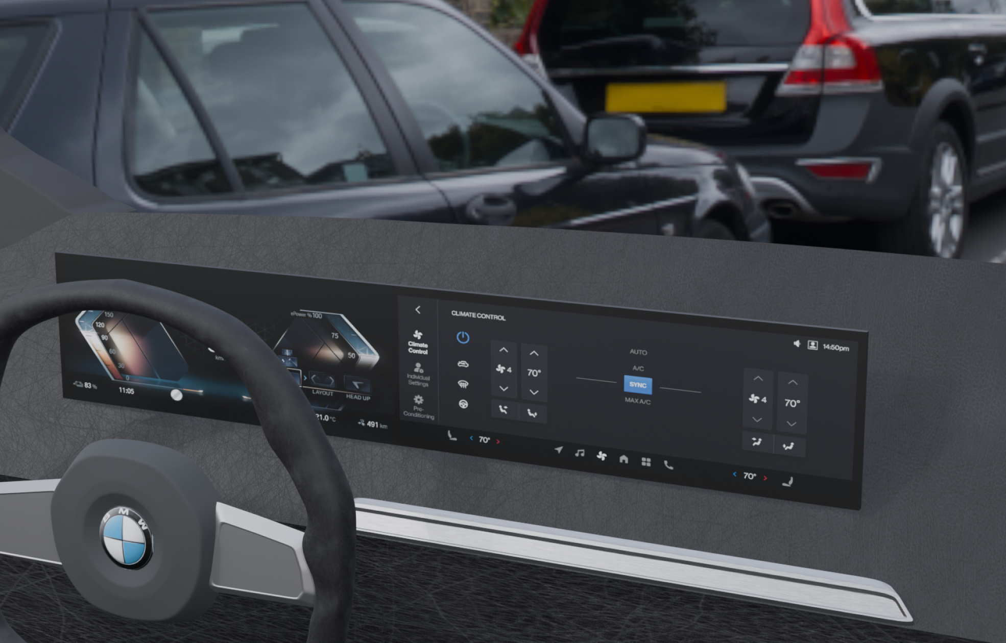
Redesign BMW 8.5 dashboard to help drivers reduce cognitive load while interacting with the car dashboard intuitively and efficiently.
My Deliverables
UI/UX Design
User Research
Service Design
Problem Statement
How might we redesign the BMW iDrive 8.5 system to help drivers reduce cognitive load while interacting with the car dashboard intuitively and efficiently?
Problem Space
-
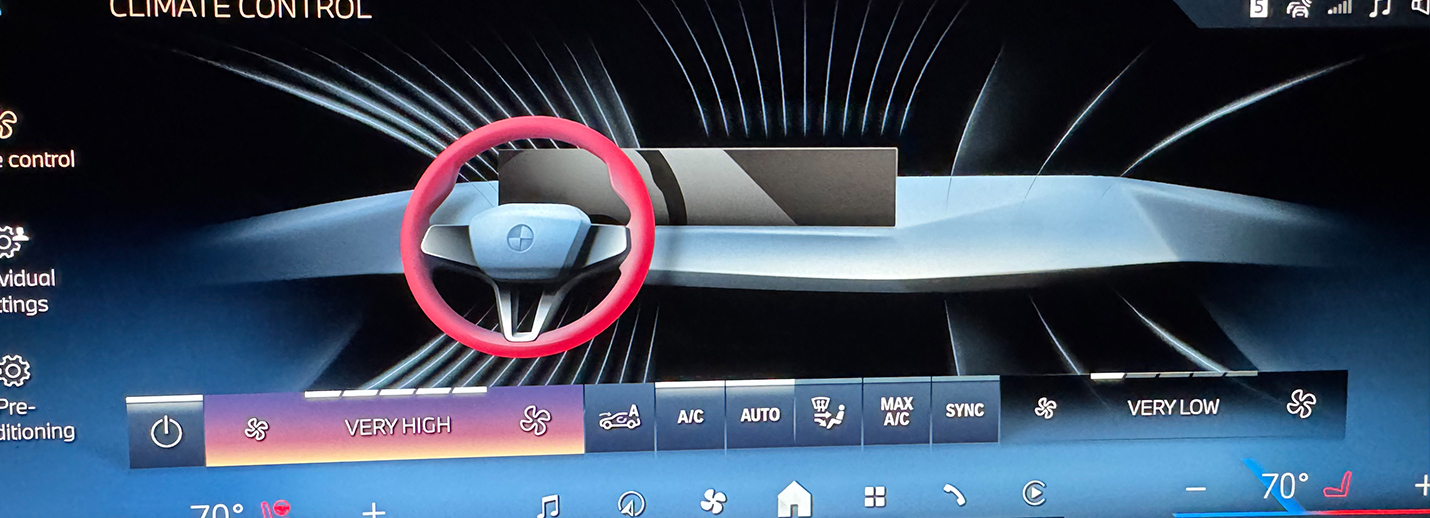
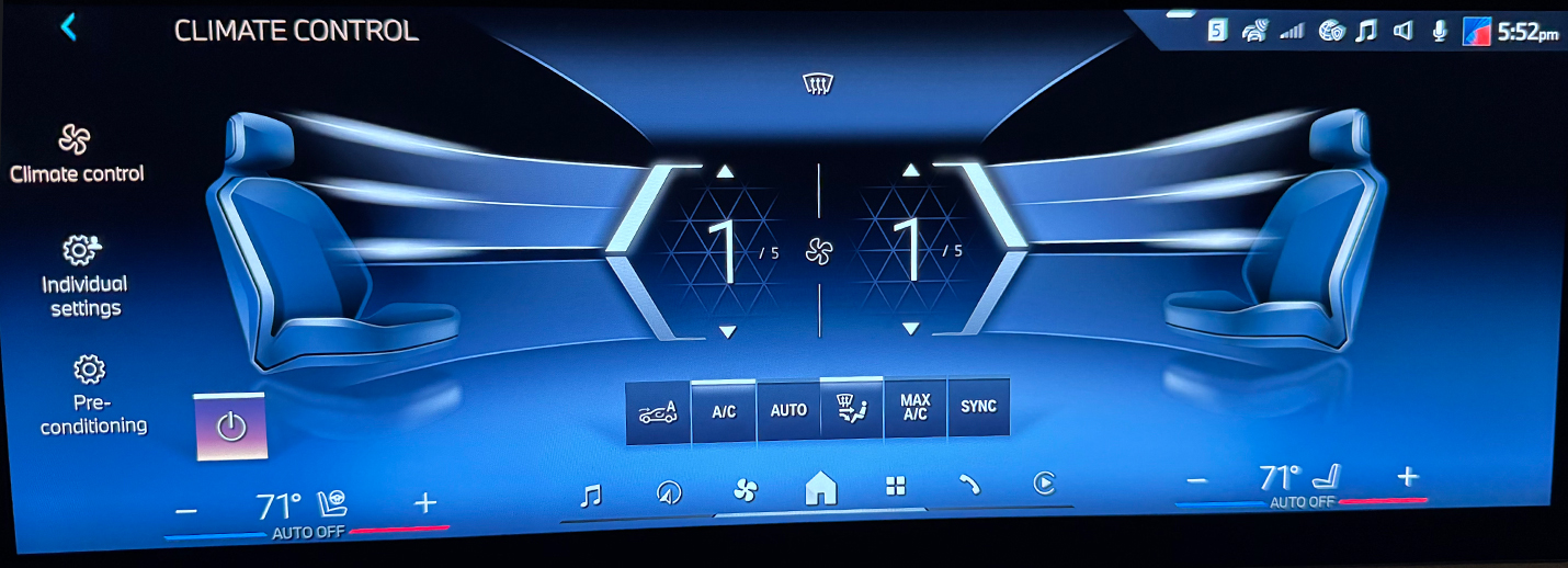
#1: Over-complicated climate control
Overcomplicated climate control with a cluttered UI, nested menus, and multi-step clicking.
-
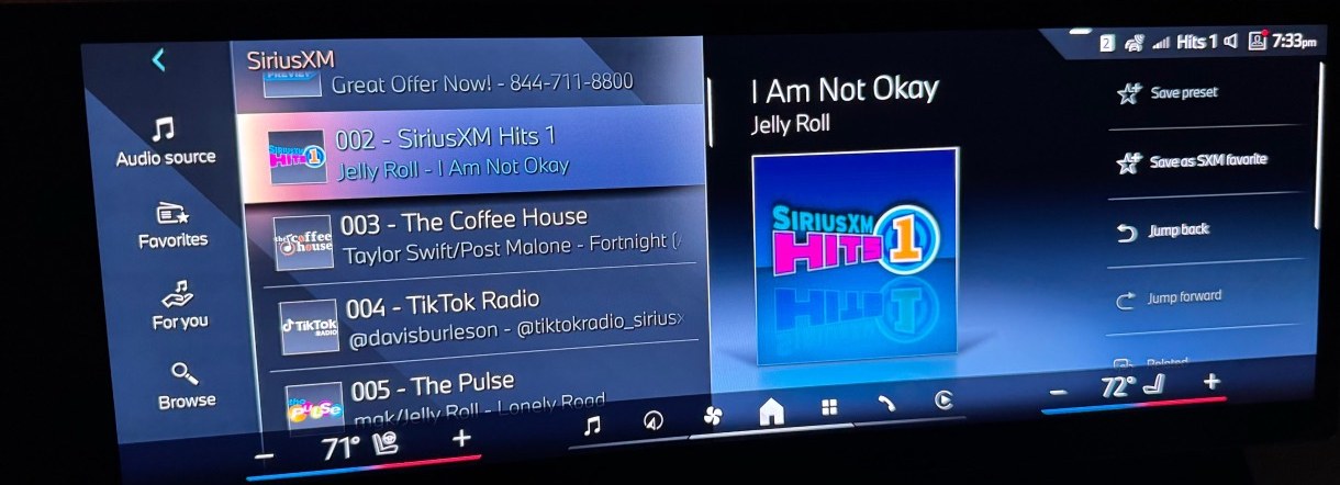
#2: Confusing Media Control Interface
Media controls feel clunky, and simple tasks require unintuitive navigation. For example, the music playback page does not have a pause button.
-
#3: Overwhelming All Apps menu
The "All Apps" menu is also overwhelming, as it displays too many options at once with an outdated UI.
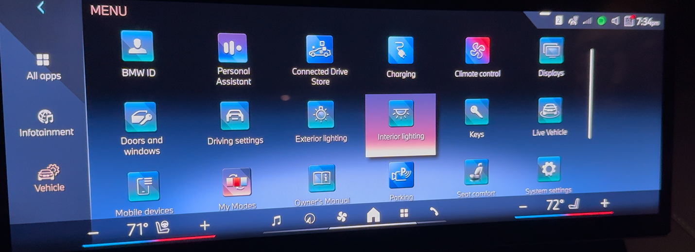
Dashboard Redesign Concept
Redesign #1: All apps Comparison
Flattened icons were used to replace the current 3D icons, and a mono-color was implemented for highlighting instead of gradient colors, as gradients were found to be distracting for drivers. The bottom control bar was also refined with an improved hierarchy.
Overall, the UI was given a more modern feel, making the entire layout more concise and clear.
A new seat control icon was added to the bottom climate control shortcut, enabling users to directly view and adjust seat heating and cooling levels intuitively. This reduces the cognitive load for drivers.
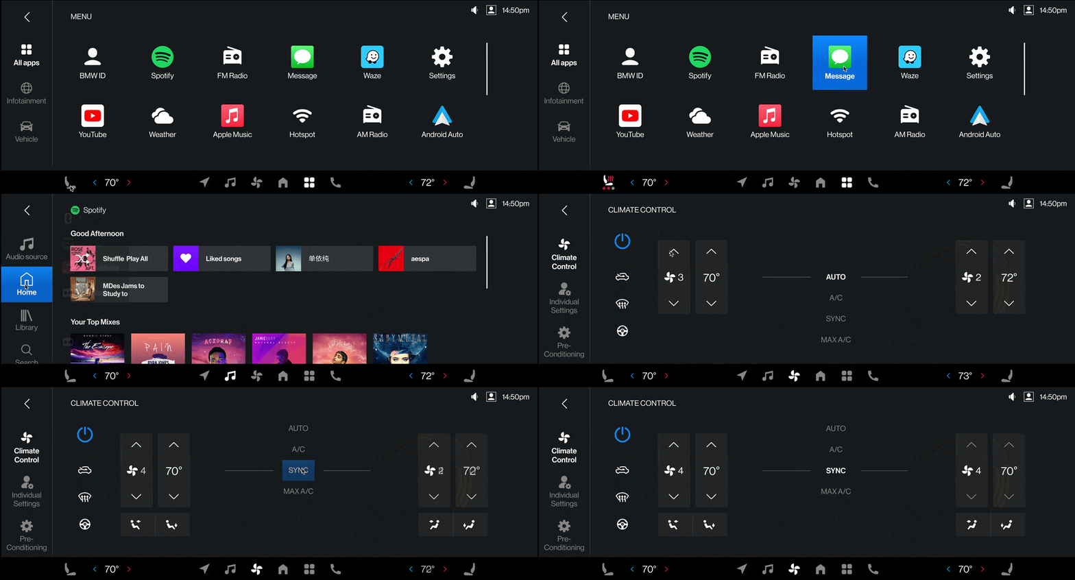
Redesign #2: Media Comparison
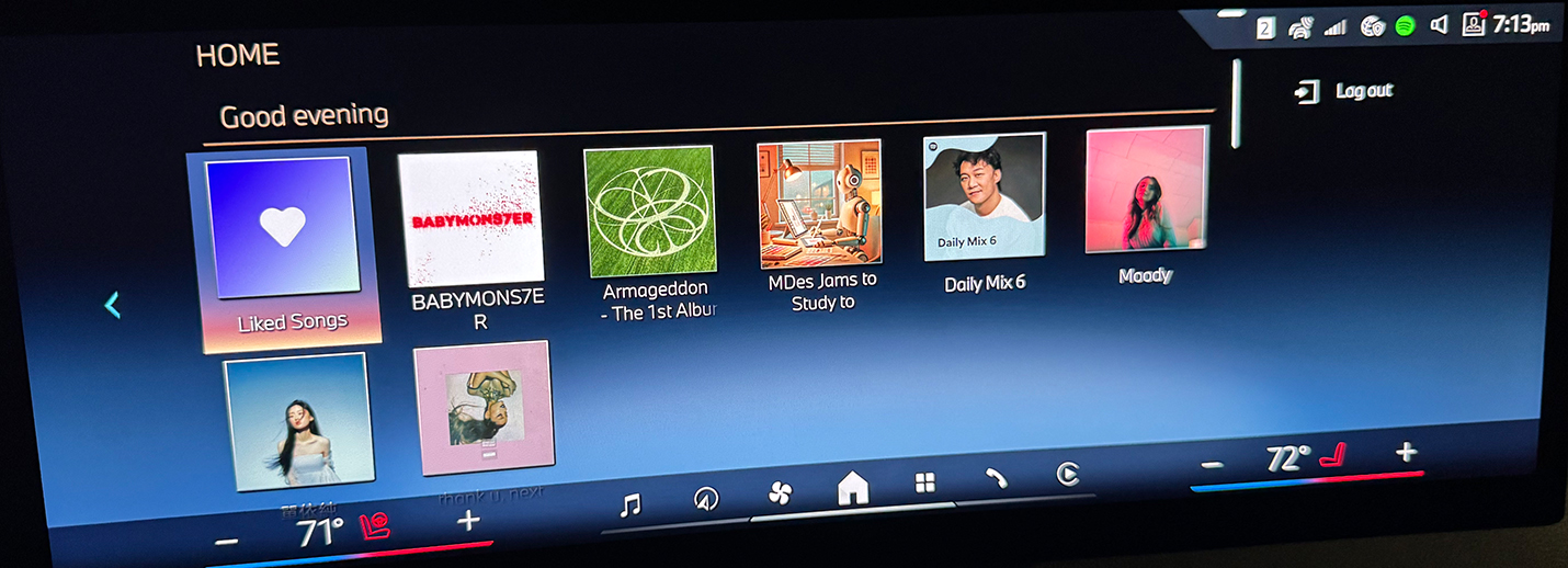
According to the user interview I conducted, people were complaining about the inefficient usage of the layout. For example, the music playback screen lacks a pause button.
In the redesign, the control hierarchy was flattened, reducing the steps to access a favorite song from five taps to two. A different layout was implemented to increase screen space utilization. The general UX of the existing Spotify app was followed, with the addition of a "Shuffle Play All" button to quickly shuffle and play songs from all existing playlists.
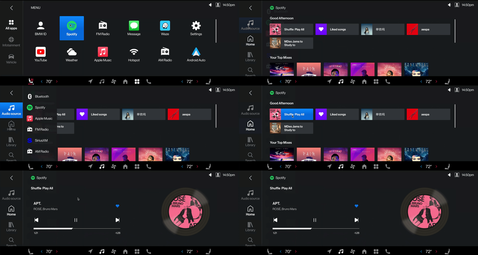
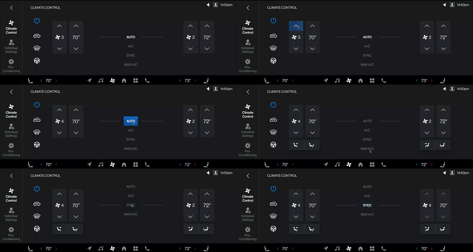
Redesign #3: Climate Control Comparison
In the existing dashboard on the right, auto and manual modes are shown in two very different UI and controlled by a rocker switch button. Steering wheel heating can be turned on and off in the auto mode, but can not heat and cool the seat.
My redesign consolidates the control in different modes and presents everything needed in a single intuitive experience. Driver can access the climate control from the bottom shortcut. When not in auto mode, airflow direction can be manually selected. Other controls such as steering wheel heating and defrost can be quickly accessed through the icons on the left. This design better utilized the screen space and reduced driver's cognitive load by reducing the search and interaction time.
Service Design
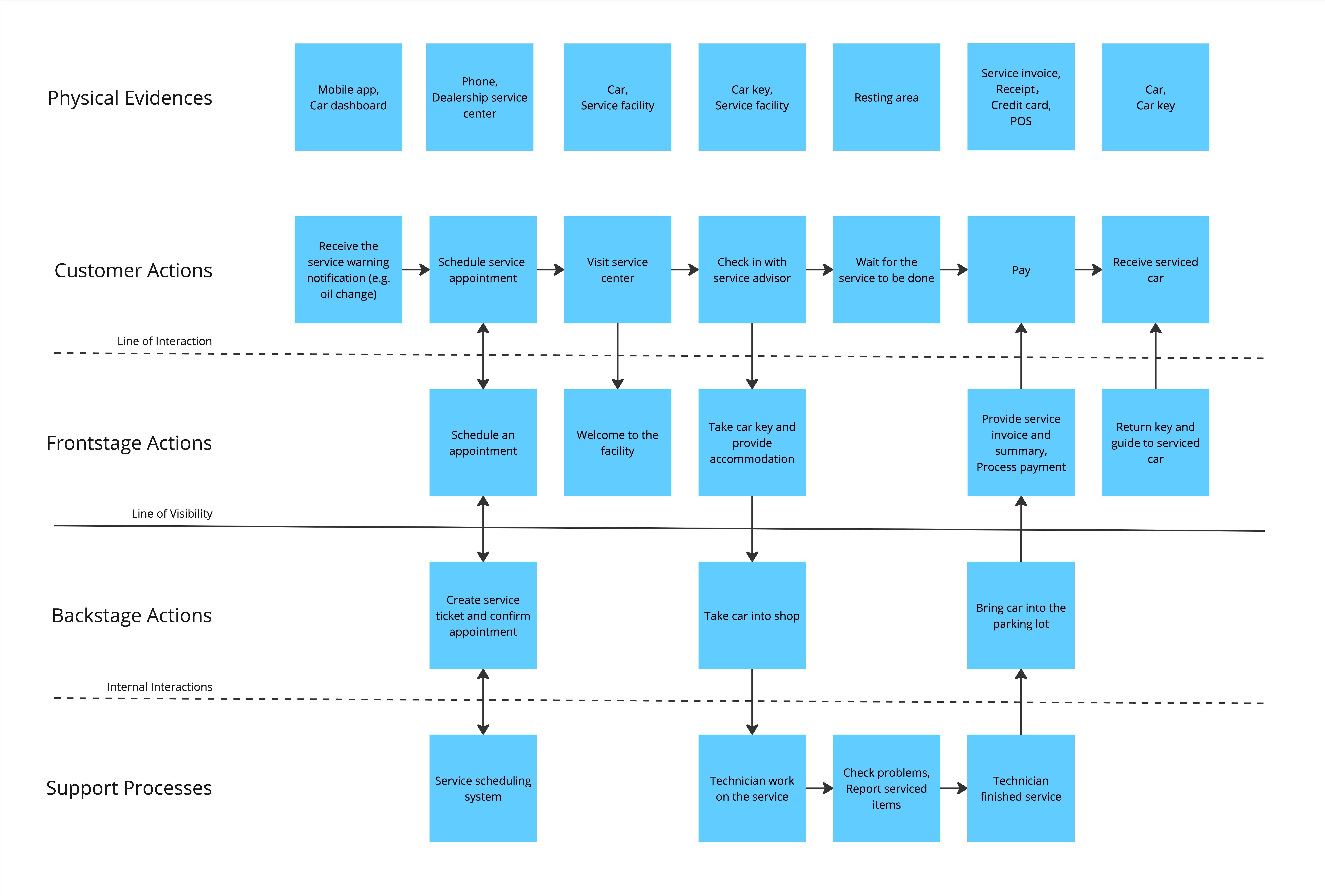
Service Design Blueprint
Through creating the service design blueprint, I got a clear view of the key touchpoints and interactions that make up the customer experience for the car maintenance service. The different stages the customer goes through, from receiving the service alert all the way to retrieving their car after the work is complete.
By understanding these backstage elements, I can identify opportunities to streamline workflows, improve communication, and ensure the supporting systems and processes are optimized to deliver a seamless experience for the customer.
Solution
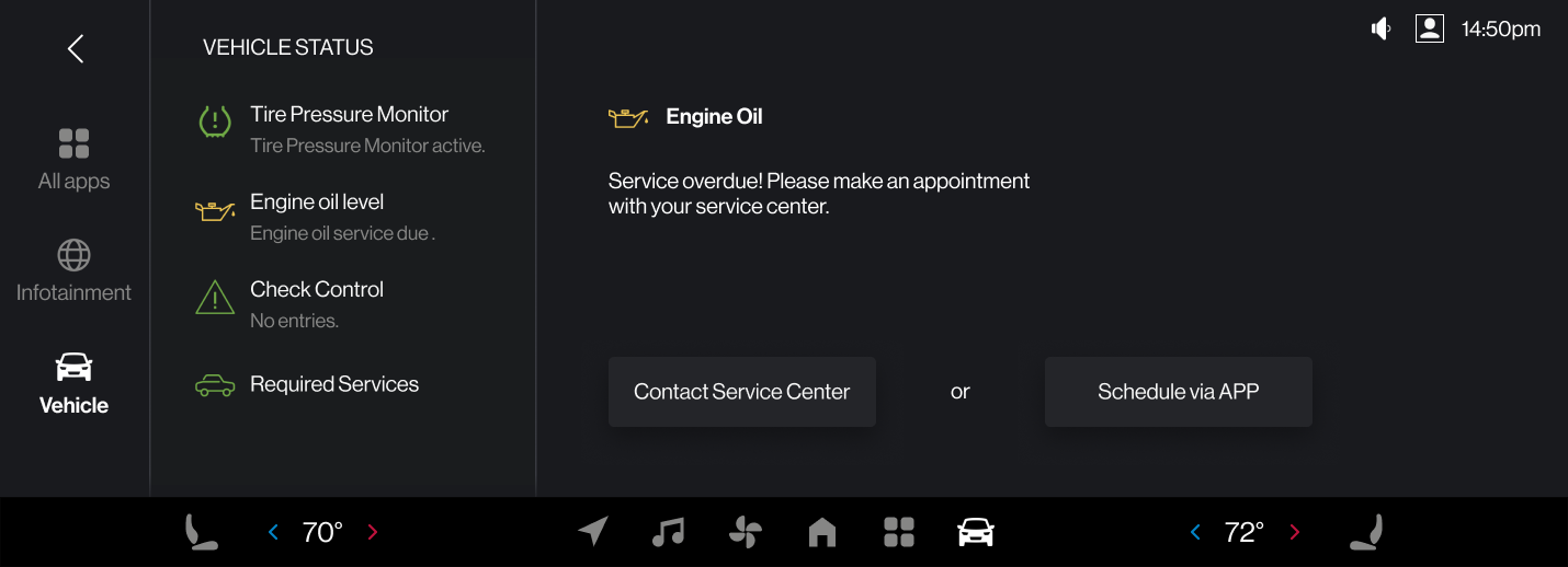
The dashboard will show details about the maintenance alert and provide ways for the users to schedule services. If users tap the app button on the dashboard, a QR code will be popped and users can scan it to directly jump to the scheduling page on the app.
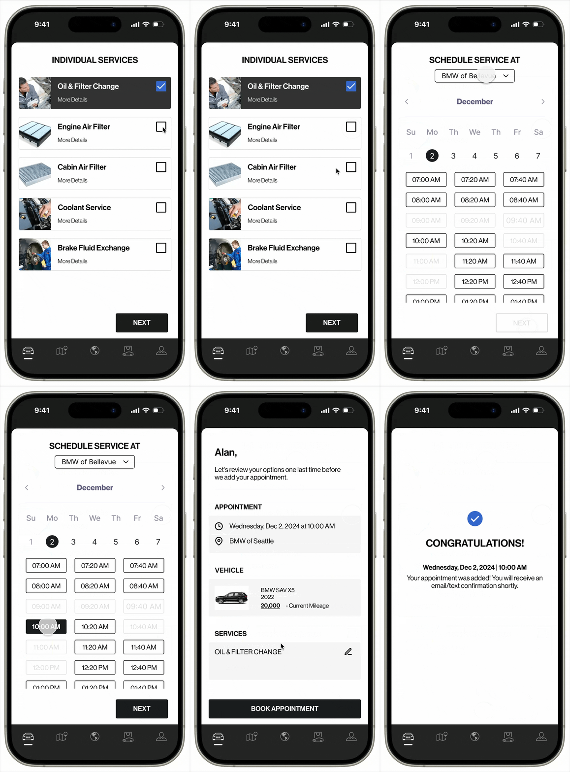
The redesign prototype of the scheduling experience via the mobile app, which doesn't currently exist. Users can conveniently select what service to perform, time of the appointment, and review the information or provide notes before scheduling. Within just simple 4 steps, a maintenance appointment can be scheduled. This could greatly reduce the anxiety caused by these maintenance alerts.
Outcomes and Learnings
Through this project, I started diving into Human Machine Interaction design, and I found it so different from what I was used to, such as mobile apps or web design. It requires the interface to strip away anything non-essential and prioritize immediate, real-time interactions and present critical information in a clear and glanceable way. It gaves me a deeper understanding of interactive design fundamentals and how to create interfaces that are tailored to the user's needs and environment.
Service design is important because it offers a transformative perspective that extends beyond screen-level interactions. Through it, I gained a holistic view about user experiences, mapping entire customer journeys across multiple touchpoints and understanding how backend processes, and organizational systems inter-connect.